Pantone Colors of the Year 2016: Serenity & Rose Quartz
A Softer Take on Colour: For the first time, the blending of two shades – Serenity and Rose Quartz – are chosen as the Pantone Colour of the Year
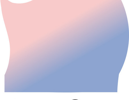
Pantone, an X-Rite company and the global authority on colour and provider of professional colour standards for the design industries, today announced PANTONE 15-3919 Serenity and PANTONE 13-1520 Rose Quartz as the PANTONE® Colour of the Year selection for 2016; a harmonious pairing of inviting shades that embody a mind-set of tranquillity and inner peace.
As consumers seek mindfulness and well-being as an antidote to the stress of modern day lives, welcoming colours that psychologically fulfil the yearning for reassurance and security are becoming more prominent. Weightless and airy, like the expanse of the blue sky above us, Serenity comforts with a calming effect, bringing feelings of respite and relaxation even in turbulent times. Rose Quartz is a persuasive yet gentle tone that conveys compassion and a sense of composure.
“With the whole greater than its individual parts, joined together Serenity and Rose Quartz demonstrate an inherent balance between a warmer embracing rose tone and the cooler tranquil blue, reflecting connection and wellness as well as a soothing sense of order and peace,” said Leatrice Eiseman, Executive Director of the Pantone Color Institute.
The prevalent combination of Serenity and Rose Quartz also challenges some more traditional perceptions around colour association. “In many parts of the world we are experiencing a gender blur as it relates to fashion, which has in turn impacted colour trends throughout all other areas of design,” said Eiseman. The Colour(s) of the Year 2016: Serentiy and Rose Quartz. “This more multilateral approach to colour is coinciding with societal movements toward gender equality and fluidity, the consumers’ increased comfort with using colour as a form of expression which includes a generation that has less concern about being typecast or judged, and an open exchange of digital information that has opened our eyes to different approaches to colour usage.”
Serenity and Rose Quartz for Fashion
The combination of Serenity and Rose Quartz was featured on the runways for both men and women and highlighted in the PANTONE Fashion Colour Report Spring 2016 with Emilio Pucci, Leanne Marshall, BCBG and Richard James, among others who incorporated this harmonious colour pairing into their recent collections. Playful yet sophisticated, this colour duo makes a striking statement on its own, though it works equally well as an accent when joined with other shades. With playful escapism as a theme for many, the pairing of shades can be expressed through patterning, plaids, floral prints, striping and colour blocking. Variations of this hue will be seen in a variety of textures that make it wearable throughout the year, from warming and comforting plush wools and faux furs to more ethereal feeling, lightweight linens and cottons. Serenity and Rose Quartz are also a popular choice for jewellery and fashion accessories, including handbags, hats, footwear and wearable technology.
This engaging combination also works easily with other mid-tones, including cooler greens and purples. Pair with Lime Popsicle and Silver for some splash and sparkle, Old Rose for some tender nostalgia, or the velvety Fondue Fudge, which makes for a rich background.
Serenity and Rose Quartz for Beauty
The pairing offers a variety of lip, cheek and eye palette options, as well as hues for nail colour. Flattering against many skin tones, beauty looks pairing the light-hearted, healthy glow of Rose Quartz, with the cool, refreshing tone of Serenity, create a soft and natural statement. Done with a natural, light touch, the flattering pink that enhances the lip, cheek and eye, can be blended with a hint of the cool blue tone that contributes to a beautiful, neutral-based eye shadow palette, accented by classic solid nails or creative nail art that incorporates both shades in the design. Juxtapose with neons for a bold and interesting contrast. Appealing in all finishes, matte, metallic and glossy, a layer of silver sparkle creates added drama.
Serenity and Rose Quartz for Interiors
Whether on their own or combined with other shades, the pairing of Serenity and Rose Quartz brings a feeling of calm and relaxation into the home environment. Like a serene sunset, Rose Quartz encourages reflection on one’s surroundings while Serenity, a transcendent blue, provides a naturally connected sense of space. An ideal choice for rugs and upholstery, Serenity and Rose Quartz also work well in paint and for decorative accessories. Coupling solid and patterned fabrics, throws, pillows and bedding in these shades provides a comforting respite and feeling of well-being in the home. Incorporating texture enhances the duality and kinship of these hues. Serenity and Rose Quartz coloured kitchen items and tableware, as well as home accessories like candles, decorative bowls, vases and florals, add subtle colour accents while contributing to a welcoming and peaceful space. Translucent, glazing, matte and metallic shine are key finishes.
Serenity and Rose Quartz for Graphic Design
Strong, yet calming, romantic yet subtle, consumers are immediately drawn to this combination, making it an enticing shade for a variety of products from food and beverage to cosmetics and accessories. With packaging becoming increasingly more tied into lifestyle colour trends, the combination of Serenity and Rose Quartz is a natural fit for many kinds of packaging materials.
About the PANTONE Colour of the Year
The Colour of the Year selection process requires thoughtful consideration and trend analysis. To arrive at the selection each year, Pantone’s colour experts at the Pantone Color Institute comb the world looking for new colour influences. This can include the entertainment industry and films in production, traveling art collections and new artists, fashion, all areas of design, popular travel destinations, as well as new lifestyles, playstyles and socio-economic conditions. Influences may also stem from new technologies, materials, textures and effects that impact colour, relevant social media platforms and even up-coming sporting events that capture worldwide attention. For 16 years, Pantone’s Colour of the Year has influenced product development and purchasing decisions in multiple industries, including fashion, home furnishings and industrial design, as well as product packaging and graphic design.
Related Posts

Bliss Couture: Inspiring the Future and Redefining Psychedelic Fashion →

The Elegant Evolution of Men’s Formal Attire: A Look at Peak Lapel Suits and Tuxedos →

Leather Jackets: A Style Anthem for Music Lovers →